Last updated:
September 09, 2025
Portfolio design expert? Stand out now!
Designer? Discover how to create a standout portfolio that gets you hired by showcasing original thinking and measurable impact. Learn more now!
How NOT to Get Hired as a Designer
You are moving fast, shipping product, and your brand is catching up with your growth. Yet your website does not reflect who you are anymore. You get traffic, but it does not convert. You have outgrown your agency and you need a partner who actually cares. If that sounds familiar, you are the kind of founder or marketing lead we love working with. You want strategic clarity that maps to revenue, a website that converts, and an SEO system that scales. You also care about the details without wanting to micromanage. Same here.
Now for a quick story that matters to your hiring decisions and your growth engine.
The weekend I reviewed 600+ portfolios
This weekend, I reviewed 600+ designer portfolios and sent assignments to a select few. One submission looked familiar. After digging, I found the exact design online. It was a copy with just text changes. PSA: Using HTML → Figma plugins to populate your portfolio is not okay. Changing text on an existing design is not design work – it is copying. Many designers are using plugins to copy illustrations from famous websites. A startup founder might fall for this, but I have seen so many sites at this point that it is hard to fool. Learn from great sites? Yes. Openly copy? No. This shows laziness and lack of integrity. Stop looking for shortcuts. Do the work. Be original. Your portfolio should showcase YOUR skills, not others’.
For clarity, an HTML to Figma plugin is a tool that imports a live web page’s code and assets into Figma as editable layers. It is useful for audits and teardown studies, but passing that import off as your original design is dishonest.
Why copying kills trust, conversion, and momentum
Firstly, copying breaks trust. If a designer will copy a layout today, they might cut corners on brand voice, accessibility, or analytics tomorrow. Secondly, it hurts conversion. Your buyers are not generic. Your value proposition, pricing logic, and proof points are unique. A lookalike design rarely maps to your funnel friction or user intent, so performance suffers.
There is legal and reputational risk too. Design plagiarism is the act of presenting someone else’s visual or interaction work as your own. You might also inherit licensing issues for fonts and illustrations. Moreover, copied work stalls your internal learning loop. You do not discover what messaging, structure, and patterns truly move your audience because you never did the thinking.
What great portfolios show instead
High caliber designers build trust by revealing their thinking and the impact. In addition, they make tradeoffs explicit and connect UI choices to outcomes.
- Problem framing tied to business goals. Clear before-and-after. Baselines and success criteria.
- User research signals. Even scrappy interviews and surveys count. An affinity map is a simple clustering of insights to find themes.
- Information Architecture clarity. IA is how content is organized so users find what they need quickly.
- Systems thinking. Components, states, and design tokens which are named values for colors, spacing, and typography to keep things consistent.
- Accessibility and performance awareness. A quick Lighthouse run, color contrast proof, and alt text plan go a long way.
- Outcome metrics. Conversion lift, reduced time to task, or improved qualified lead rate.
- Collaboration. Notes on partnering with devs, marketing, and founders, including how constraints were managed.
How to build an honest, standout portfolio quickly
Speed matters, but integrity matters more. Therefore, ship work you can own end to end and prove.
- Pick 3 meaningful projects. One real product, one redesign with clear credit to the original source, and one self-initiated idea aimed at a real business problem.
- Write a one-paragraph brief. Define audience, goal, constraints, and success metrics. A constraint is any limit like timeline, budget, or dev capacity that shapes the solution.
- Show your process. Low fidelity wireframes, content hierarchy, and iterations. Explain what you removed and why.
- Prototype the critical path. A prototype is an interactive mock-up that demonstrates the key flow without full code.
- Measure something. Even small A-B tests count. A-B testing compares two versions to see which performs better.
- Credit inspiration and assets. If you used a template or icon set, name it. Transparency builds trust.
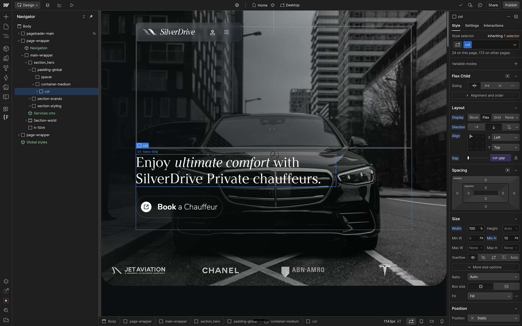
- Publish the Figma link. Let people see your component structure and naming. A component is a reusable UI part like a button with variants.
For founders and marketing leaders: how to spot copycats and hire with confidence
Hiring a designer who copies costs you time, reputation, and conversion. Here is a pragmatic, low-lift screening system.
- Ask for raw files. Open Figma, inspect components, styles, and version history. Thin layers without meaningful naming are a red flag.
- Request a 90-minute constrained redesign. Same content, new structure. No external assets allowed. Watch how they reason about hierarchy and tradeoffs.
- Run a reverse image search. Reverse image search finds visually similar images on the web to detect uncredited reuse.
- Probe for metrics. How did they define success and what changed post-launch. Vague answers suggest portfolio theater.
- Check accessibility hygiene. Ask for their approach to alt text, focus states, and contrast. Accessibility means making digital products usable for people with disabilities.
- Call a collaborator. Speak to a developer or PM about how this designer handled handoff and iteration.
Real-world mini cases: what good and bad look like
Examples beat theory. Below are quick scenarios with context, application, pros, cons, and a takeaway.
Case 1 – The lookalike SaaS landing
Intro: A candidate submitted a slick B2B SaaS homepage for a security startup. It felt familiar.
Application: We found the same hero layout, illustration style, and pricing grid on a well-known analytics tool. Only the headlines changed. The candidate used an HTML to Figma import and reskinned text.
Pros: Pixel polish. Good typography pairing.
Cons: No original IA, no component logic, no metrics, no problem framing. Risk of brand confusion.
Takeaway: Beauty without authorship is theater. Pass.
Case 2 – The transparent template
Intro: Another candidate used a paid template for a fintech marketing site.
Application: They documented what the template provided, then showed how they extended the design system, replaced the grid, and built custom components for pricing and calculator flows. They cited the license.
Pros: Honest sourcing, strong system thinking, measurable uplift on signups.
Cons: Visual novelty was moderate.
Takeaway: Transparent use of templates is fine when you add original problem-solving and results.
Case 3 – The messy but real junior
Intro: A junior designer showed a rough marketplace redesign.
Application: They interviewed 5 sellers, mapped friction, simplified the listing flow, and shipped a prototype that reduced steps from 8 to 4. Screens were not perfect, but the logic was solid.
Pros: Real user insight, clear IA, measurable task time reduction.
Cons: Visual craft needs coaching.
Takeaway: Hire for thinking and teach polish. Strong yes.
Case 4 – The brand refresh with numbers
Intro: A mid-level designer led a B2C rebrand.
Application: They aligned messaging, rebuilt the component library, and launched new landing pages. They reported a 28 percent lift in add-to-cart and a 17 percent drop in bounce on mobile.
Pros: Outcome-driven, cross-functional collaboration.
Cons: Some sections were light on accessibility details.
Takeaway: Show your fingerprint on both brand and performance.
The standard you should hire and design to
Original thinking over shortcut plugins. Process over theater. Outcomes over case study fluff. If you are a fast-moving company in a luxury or premium segment with real traction, you deserve design that elevates your brand and moves KPIs, not recycled layouts.
Ready to build a website that converts and a hiring bar that protects your brand
Viralistic helps funded startups and scale-ups connect story, SEO, and design into one conversion engine. We move fast, sweat the details, and stay reachable on the channel you prefer. If you want strategic clarity, SEO that compounds, and a site that actually sells, let’s talk. Start here: https://viralistic.nl/contact/
People Also Ask
Is it ever okay to use an HTML to Figma plugin in a portfolio?
Yes, for audits and teardowns with clear credit. An audit is a structured review of a site to find issues and opportunities. Never present imported layers as original work.
What is the difference between inspiration and plagiarism in design?
Inspiration informs your direction. Plagiarism replicates structure, layout, or assets without transformation or credit. If your wireframe, grid, and visuals mirror the source, you copied.
How many projects should a design portfolio include?
Three to five strong case studies beat ten surface-level screenshots. Include at least one with measurable outcomes.
What should a UX case study include?
Problem, audience, constraints, process, key decisions, prototype, and results. Define terms as you go so stakeholders follow the logic.
How can founders detect copied designs quickly?
Ask for raw Figma links, check version history, run reverse image search, and request a timed redesign with no external assets.
Is it legal to copy a website layout?
Legal lines vary by jurisdiction, but copying can violate copyright or licenses. Ethics aside, it is a brand and hiring risk.
Can I use templates in professional work?
Yes, with transparency and license compliance. Extend the system, document changes, and ensure the result fits your users and goals.
How do I show impact if I lack analytics access?
Use proxy metrics. Time to task in usability tests, scroll depth, or click-through on prototypes. A proxy metric is an indirect measure that correlates with your goal.
What is CRO and why does a designer need it?
CRO means Conversion Rate Optimization. It is the practice of improving the percentage of users who take a desired action. Designers influence CRO through hierarchy, clarity, and friction reduction.
How do I credit inspiration properly?
Link the source, describe what you learned, and show how you diverged. If you used assets, cite the license.
Should I include Figma links in my portfolio?
Yes, when possible. It proves authorship, component thinking, and structure. Mask sensitive data if needed.
What is information architecture in simple terms?
Information Architecture is how content is structured so people can find and understand it quickly.
How do I run a quick usability test?
Recruit 5 users, give them tasks, and observe. A usability test evaluates how easily someone can use your design to complete a goal.
What are design tokens and why use them?
Design tokens are named variables for styles like color and spacing that keep design and code consistent.
What is a heuristic evaluation?
A heuristic evaluation is a quick expert review using usability principles to find issues without user testing.
How do I structure a take-home assignment for candidates?
Provide a tight brief, clear constraints, 90 to 120 minutes, and ask for process notes plus a low-fidelity prototype.
What are red flags in designer portfolios?
No raw files, no process, copied visuals, vague metrics, and identical layouts to famous sites.
How can design improve SEO?
Clean IA, fast performance, accessible markup, and content structure help search engines understand and rank pages. Performance means how quickly pages load and respond.
Should a portfolio include failed experiments?
Yes, briefly. Show what you learned and how it informed the next iteration.
How do I balance brand aesthetics with conversion?
Start with positioning and messaging, then design hierarchy that supports the story. Test variations to align beauty with business outcomes.
What if I am rebranding and need SEO, content, and design connected?
You need a system, not a one-off. Map keywords to pages, align narrative and IA, then design for speed and clarity. If you want help, reach out at https://viralistic.nl/contact/.