Last updated:
June 08, 2026
Luxury Web Design: What Makes a Website Feel Expensive
Luxury web design signals quality before a word is read. See what makes a website feel expensive, with the levers premium brands use to get it right.
Luxury web design is the practice of building websites that carry a premium brand’s authority online: restrained layouts, considered typography, generous whitespace, fast performance, and details that feel deliberate. It is not decoration. A luxury website signals quality before a visitor reads a single word, the same way a quiet, well-lit showroom does.
Most premium brands have this problem. The brand turns heads in the room. Online, it barely clears its throat. The logo is right, the products are exceptional, and the website still says "competent" when it should say "rare." That gap is rarely a budget problem. It is a translation problem, and luxury web design is how you close it.
We build this work for a living. Viralistic is the digital partner for premium brands, and we have taken a hidden chauffeur website and turned it into a presence that outpaces better-funded rivals, and refined a worldwide air filtration brand one considered step at a time. What follows is what we have learned about why some websites read as expensive and most do not.
What is luxury web design?
Luxury web design is website design built to project premium positioning: every choice, from the typeface to the load time, communicates standard and restraint rather than volume. High-end web design treats the website as a brand asset, not a brochure. The goal is presence. A visitor should feel the quality before they can explain it.
This separates luxury website design from ordinary web design in one word: intent. An ordinary site fills the space. A premium site decides what to leave out. Restraint is the whole craft.
What makes a website look luxury?
A website looks luxury when its typography, spacing, color, imagery, motion, and speed all hold the same high standard, with nothing fighting for attention. The feeling of luxury comes from consistency and restraint, not from more. Below are the levers that carry it.
Typography that sets the tone
Type is the first thing a visitor feels and the last thing most sites get right. A refined typeface, set at a generous size with confident line spacing, reads as quality instantly. A cramped, default system font cheapens even a beautiful product. Premium brands tend to pair one distinctive display face with one clean, highly readable body face, and stop there. Two typefaces, used with discipline, beat five used for effect.
Whitespace and the courage to leave room
Whitespace is the clearest signal of confidence in web design. Space around an element tells the visitor it matters. A luxury website gives a single product, a single line, a single image the room to breathe, the way a gallery hangs one painting on a wall instead of forty. Cluttered layouts read as anxious. Generous ones read as certain.
A restrained color palette
Premium sites commit to a small palette and hold it everywhere. Two or three colors, applied consistently, build recognition and calm. The luxury lexicon of color tends toward depth and quiet: deep neutrals, a single considered accent, high contrast used sparingly. Loud gradients and rainbow buttons are the snack bar. A disciplined palette is the suit.
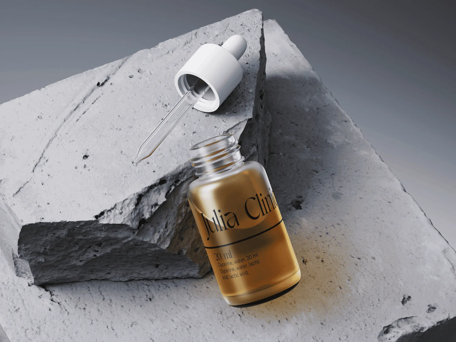
Photography and art direction
Original, well-directed imagery is non-negotiable at the premium level. Stock photography is the fastest way to tell a visitor that the brand is borrowing its taste. Real photography, shot in a consistent style with consistent light, carries the brand’s world. For a high-value brand, the difference between commissioned and generic imagery is the difference between owning the room and renting it.
Motion that whispers
Subtle microinteractions, a slow reveal as a section enters view, a button that responds with a hint of weight, signal craft. The rule is restraint. Motion in luxury web design is felt more than seen. Animation that performs for its own sake reads as a circus. One considered transition does more than ten.
Performance, because slow is not luxurious
A luxury website is fast. Speed is a status signal, and visitors read delay as carelessness. Google’s Core Web Vitals measure exactly this: how quickly the main content loads, how stable the layout is, how responsive the page feels. A site can look exquisite and still feel cheap if it stutters. Performance is part of the finish, not a technical afterthought.
Consistency across every touchpoint
The single strongest signal of a premium brand online is consistency. The same standard in the typography, the spacing, the tone of the words, the motion, on every page and every screen. Premium brands tolerate no inconsistency. One off-brand page, one stretched logo, one generic stock image, and the spell breaks. Luxury is the absence of the wrong note.
Luxury web design is not an expensive-looking template
The most common mistake premium brands make is buying the costume instead of the wardrobe. A polished template can look high-end in a preview and still fail, because a template cannot carry a brand. It carries the template’s brand.
Real luxury website design starts from the brand itself: its story, its standard, its customer, its single point of difference. The layout follows the brand, not the other way around. This is why the best luxury websites rarely look like each other. They look like the brands behind them. A premium villa atelier and a worldwide manufacturer share a standard, not a style.
There is a quiet test for this. Strip the logo off the homepage. If the site could belong to any competitor, it is decoration. If it could only be this brand, it is design.
Where to find luxury web design examples
For visual reference, curated galleries are the fastest way to study the field. Awwwards, Siteinspire, and Behance collect high-end website work and let you filter by the luxury category, and Webflow’s own showcase is strong for premium brand sites. Study them for one thing: how much they leave out.
Looking at examples is useful, but copying them is not. A luxury website example tells you what restraint looks like in someone else’s hands. The job is to find what restraint looks like in yours. That answer lives in the brand, which is why the work begins with a conversation, not a template.
How to choose a luxury web design partner
Choose a partner who leads with strategy, owns the whole picture, and can show premium work, not one who starts by asking which template you like. The risk for a high-value brand is fragmentation: a designer, a developer, and an optimizer who each do their part and lose the brand in the gaps between them.
Look for three things. One accountable hand on the whole, so nothing falls between specialists. Real authority in both worlds, technology and luxury, because the gap between people who understand code and people who understand quality is where premium brands get let down. And work you can see, reviewed in the open. We are an n8n Ambassador and a top-ranked Webflow agency in the Netherlands, reviewed on Trustpilot and Google, and we begin only where there is a mutual fit. A guide cannot protect a brand it does not believe in.
Frequently asked questions
What makes a website look luxury?
A website looks luxury when typography, whitespace, color, imagery, motion, and speed all hold one high standard with nothing competing for attention. Refined type, generous space, a restrained palette, original photography, and fast performance signal quality. The feeling comes from consistency and restraint, not from adding more.
What is a high-end website?
A high-end website is one built to project a premium brand’s authority and standard, where every detail is deliberate and the experience feels effortless. It prioritizes brand storytelling, original art direction, and fast, stable performance over templates and stock assets. The aim is presence: trust earned at first impression, before a word is read.
What are the 7 C’s of a website?
The commonly cited 7 C’s of web design are Context, Content, Community, Customization, Communication, Connection, and Commerce. They come from a customer-interface framework and describe what a site needs to serve users well. For premium brands, Context and Content carry the most weight, since they shape how quality is felt.
What is the 3 second rule in website design?
The 3 second rule holds that a website should communicate its purpose, and load its main content, within about three seconds, or visitors leave. Slow pages lose attention and read as careless. For luxury web design this is a brand issue, not only a technical one: speed is part of the finish, measured by Google’s Core Web Vitals.
How much does a luxury website cost?
A premium website is priced by scope, not by template, so a single figure misleads. Cost reflects strategy, original design, custom build, and the standard of finish. The honest answer is that it depends on the brand and the ambition, and the right starting point is a conversation that defines what the project actually needs.
Is Webflow good for luxury web design?
Yes. Webflow gives designers precise control over layout, typography, and motion without compromise, which suits the restraint and craft premium brands require. It also produces fast, stable sites that perform well on Core Web Vitals. The platform is a strong fit; the outcome still depends on the standard of the team using it.
How long does a premium website take to build?
A considered premium website typically takes several weeks to a few months, depending on scope, photography, and content. Rushing the work shows. The timeline covers strategy, original design, build, and refinement, with each step delivered as a finished piece you keep, so the project compounds rather than stalls.
Start with a conversation
Your brand already holds authority in the room. Online, it should carry the same standard, effortlessly, at every touchpoint. That is the work.
Start with a conversation. We will show you where your presence is leaking authority, and what to do first. No template. No roster of specialists to coordinate. One accountable partner, and a presence built to your standard.
A brand is only as strong as its weakest impression.
Let's make it a strong one.
Marrallisa shortly analyses your actual presence and provides options to stop your authority leaks.
Strategic CallDiscover other blogs
Our Proven Succesformula
A strategic conversation about your brand, ambitions, and digital challenges. Together we decide whether there is a mutual fit, and define a clear direction.
We translate your identity into one strategy where design, technology, and optimization align, and hand you a roadmap of priorities and opportunities.
We build under one direction, a digital experience that feels consistent, controlled, and premium. Online, the brand carries the authority it already has offline.
Reviews
Do you only build websites?
No. A website is one room in the house. We work across branding, web, search, and automation, under one hand, so the whole presence holds together. The website is simply the part people see first.
With all the AI, will my brand sound like everyone else?
No. Automation handles the repetitive work so nothing drains your team, but a human keeps a hand on everything that reaches the public. The result is quality you can stand behind. No slop.
What happens on the first call?
We look at where your presence stands, decide together whether there is a mutual fit, and you leave with a clear read on where it is leaking authority and what to do first. A conversation, not a pitch.
This sounds expensive. Is it?
The projects we do vary from 10K - 75K, depending on design complexity needed.
You are never asked to commit to a significant investment at the start, because our way of working is modular, we work with in-between steps so you can understand the value that we are providing for you from the beginning. In this way, your investment is safe and ready to be confirmed with KPI's.
We begin with the one phase that creates the most visible result for the smallest investment, and every step after that is a finished piece you keep. You set the pace.