Last updated:
September 05, 2025
Wireframes: strategy before design
Wireframes are often seen as simple sketches of a website, a blueprint of how pages should look. But a strong wireframe is much more than that. It’s a strategic tool that must align with the business case behind the website. Without this connection, you risk building a visually attractive site that solves nothing and adds […]
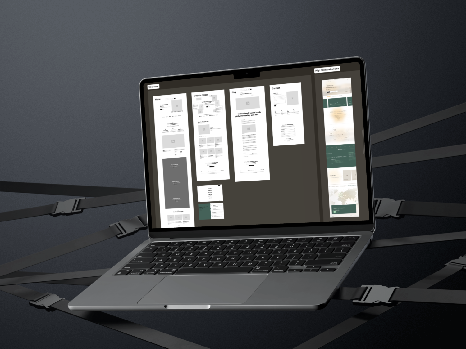
Wireframes are often seen as simple sketches of a website, a blueprint of how pages should look. But a strong wireframe is much more than that. It’s a strategic tool that must align with the business case behind the website. Without this connection, you risk building a visually attractive site that solves nothing and adds little value.
Why wireframes are more than design
A wireframe without research is an empty shell. Before drawing a single line, you need to understand what problem you are solving.
What are the company’s goals?
How does the customer’s psychological journey unfold?
Only when you know how prospects think, where their doubts lie, and what questions they need answered, can you create a wireframe that drives results.
The first layers of a wireframe
Visitors follow a predictable thought process when they land on a site. Your wireframe should guide them step by step.
At the very top, they want to know: what company am I dealing with, and what value do they bring? That’s the opening. The next sections must support this promise with evidence — think results, case studies, or testimonials. In this way, the wireframe builds trust as visitors scroll down.
The importance of call-to-actions (CTAs)
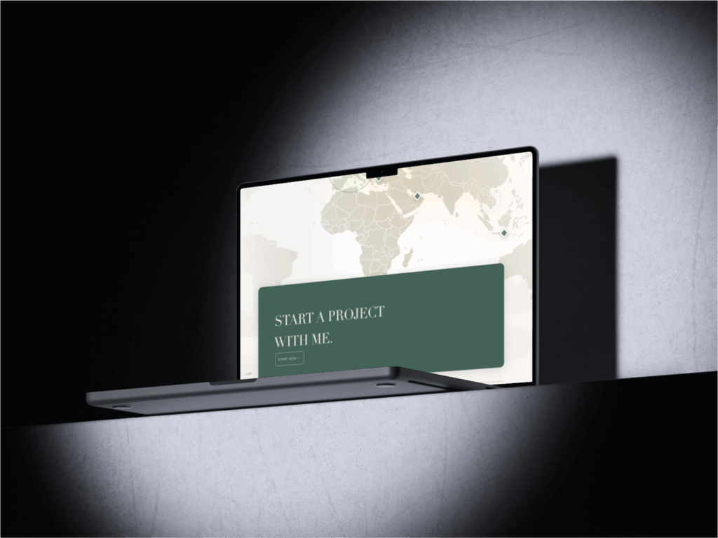
A wireframe is incomplete without well-placed CTAs. The primary CTA should be clear and distraction-free, such as booking a call or requesting a quote.
For those not ready yet, a secondary CTA can offer a softer step: for example, downloading a guide or subscribing to updates. And even visitors who aren’t planning to buy yet can be engaged with a tertiary CTA, such as following your brand on social media.
Clear navigation as signposts
Navigation is the compass of your website. This is not the place to be creative with vague words. A menu must act like road signs: short, direct, and crystal clear. Labels like “Home,” “About,” “Services,” “Projects,” and “Contact” work far better than poetic alternatives like “Our Vision” or “The Promise.” This keeps users from getting lost.
The role of FAQ and footer
When visitors reach the bottom of your site, they are often looking for final answers. That’s where an FAQ section belongs: it removes any lingering doubts. Right below, the footer provides essentials: contact details, legal links, and resources that don’t need to clutter the main navigation.
This keeps the top menu lightweight while still giving users access to everything they need.
Sneak peeks on the homepage
Unlike other pages, the homepage should act as a preview of your most important cornerstone content.
It’s a gateway.
For example, if you’re a landscaping company, highlight three core services with short teasers that lead to full pages. That way, your homepage provides instant clarity and encourages deeper exploration.
A brand is only as strong as its weakest impression.
Let's make it a strong one.
Marrallisa shortly analyses your actual presence and provides options to stop your authority leaks.
Strategic CallBest steps to create an effective wireframe
Designing a wireframe is not just about arranging boxes on a screen — it’s about creating a framework that aligns with business goals and user psychology. Below are the most effective steps you can take to build a wireframe that works in practice.
1. Start with low fidelity
The first sketch of a wireframe should be as minimal as possible. Avoid focusing on colors, fonts, or visual flair. Instead, make sure every section has a clear purpose. Ask yourself: what action do I want the user to take here, and what information do they need to get there? This keeps the wireframe focused on functionality before aesthetics.
2. Add brand elements later
Once the client approves the structure, introduce the brand guidelines. Apply colors, typography, and visual identity after the framework is solid. This ensures the design is grounded in usability rather than driven by style alone.
3. Move from high-fidelity wireframe to full design
Once your structure and brand elements are in place, the next step is to elevate the wireframe into a high-fidelity version. This means replacing placeholder boxes and dummy text with realistic content, imagery, and micro-interactions. A high-fidelity wireframe should look and feel close to the final product, while still being flexible enough to adapt if changes are needed.
This stage is where you begin to consider typography hierarchy, spacing, imagery placement, and even how animations might affect the user journey. For example, you may show how a call-to-action button reacts when hovered over, or how a dropdown menu expands. The goal is to bridge the gap between abstract planning and concrete design. At this point, developers also benefit from the wireframe because it provides clear guidance on spacing, elements, and responsive behavior. Think of it as the transition from strategy to execution.
4. Build a site flow if you’re stuck
Wireframing can sometimes feel overwhelming, especially when you’re dealing with large websites with multiple services, products, or audiences. In those moments, it’s wise to take a step back and create a site flow.
A site flow is essentially a map: it shows every page you plan to build and how they connect to one another. For example, your homepage may lead to three core service pages, each of which connects to a case study, a pricing page, and eventually to a contact form. Seeing this structure on paper or screen reveals gaps, redundancies, and opportunities.
It also helps you understand the purpose of each page. Is the page meant to educate, convert, or reassure? By mapping the journey, you’ll know exactly where to place certain messages and calls-to-action. Without a site flow, you risk building wireframes that feel disconnected and lack a clear path for the user. With it, your wireframe becomes part of a larger system designed for conversion and clarity.
5. Keep it simple
Less is more, especially in the early stages. Avoid overcomplicating the layout with too many sections or unnecessary elements. If a wireframe feels bloated, users will likely find the final site difficult to navigate. Stick to the essentials and refine later.
6. Prioritize clarity
Your wireframe should make it effortless for visitors to understand what your company does and why it matters. Concise headlines, logical content order, and intuitive CTA placement are non-negotiable. Confusion is the fastest way to lose a potential customer.
7. Design for scrolling behavior
Modern users are used to scrolling — but not endlessly. Structure the page so that key messages appear at the right moments. Balance content density with white space to keep the flow natural and engaging.
8. Test with real people
Wireframes should never live in isolation. Even at the early stages, testing them with real people is invaluable. This doesn’t require a complex lab setup; sometimes, it’s as simple as sharing a clickable prototype and asking a colleague or potential user to complete a specific task.
For instance, you could ask: “Can you find where to book a consultation?” or “Where would you click to learn more about pricing?” The answers reveal whether your structure is intuitive or confusing. If users hesitate, overlook a CTA, or click in unexpected places, you know the wireframe needs adjustments.
The advantage of testing wireframes, instead of finished designs, is that changes are fast and inexpensive. It’s much easier to move sections around, rename navigation items, or add missing information when you’re still in the wireframing stage. Waiting until after development makes such fixes costly and time-consuming.
In addition, testing wireframes gives stakeholders and clients more confidence. They see that decisions are grounded in real behavior rather than assumptions. This not only improves the final product but also strengthens trust in the design process.
9. Always connect back to the business case
Every element of the wireframe should tie back to business goals. Whether it’s generating leads, informing prospects, or building trust, each section must earn its place. A wireframe that doesn’t serve a purpose is just decoration.
Frequently asked questions
What is a wireframe?
A wireframe is a schematic representation of a website that shows structure and content layout without design details.
Why should you research before making a wireframe?
Because otherwise you risk building something that looks nice but delivers little business value.
What CTAs should a wireframe include?
A primary CTA (direct action), a secondary CTA (for visitors still hesitating), and optionally a tertiary CTA (like following on social media).
Discover other blogs

Our Proven Succesformula
A strategic conversation about your brand, ambitions, and digital challenges. Together we decide whether there is a mutual fit, and define a clear direction.
We translate your identity into one strategy where design, technology, and optimization align, and hand you a roadmap of priorities and opportunities.
We build under one direction, a digital experience that feels consistent, controlled, and premium. Online, the brand carries the authority it already has offline.
Reviews
Do you only build websites?
No. A website is one room in the house. We work across branding, web, search, and automation, under one hand, so the whole presence holds together. The website is simply the part people see first.
With all the AI, will my brand sound like everyone else?
No. Automation handles the repetitive work so nothing drains your team, but a human keeps a hand on everything that reaches the public. The result is quality you can stand behind. No slop.
What happens on the first call?
We look at where your presence stands, decide together whether there is a mutual fit, and you leave with a clear read on where it is leaking authority and what to do first. A conversation, not a pitch.
This sounds expensive. Is it?
The projects we do vary from 10K - 75K, depending on design complexity needed.
You are never asked to commit to a significant investment at the start, because our way of working is modular, we work with in-between steps so you can understand the value that we are providing for you from the beginning. In this way, your investment is safe and ready to be confirmed with KPI's.
We begin with the one phase that creates the most visible result for the smallest investment, and every step after that is a finished piece you keep. You set the pace.